Map Shows Drought’s Severity
Friday, 20 July 2012 | by Pat's Picks
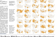
The New York Times has an excellent map in this morning’s paper, showing just how severe the drought affecting more than half of the country is. Using historical data, they’ve created a series of maps, showing which areas of the country have experienced extreme drought in June (shown in orange) for every year since 1896.
Here’s a link to an online version of the map.
SOURCE: New York Times